Sickler
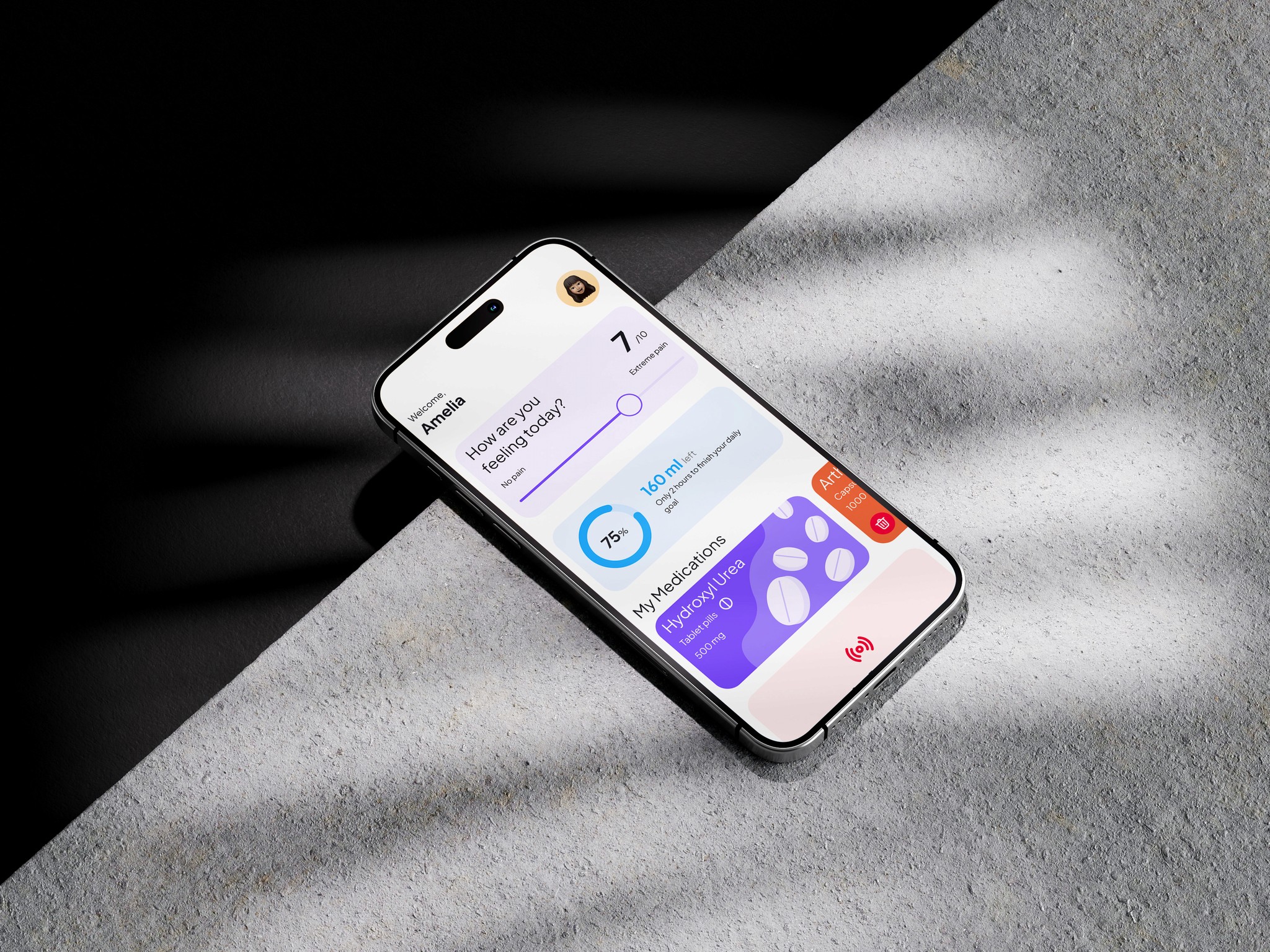
Sickler is a mobile platform that addresses the needs of people living with sickle cell. We envisioned a mobile application that helps these patients manage the disease effectively.
Mobile Design
2024
6 Months
Creating a mobile app that meets the unique needs of Cameroonians living with sickle cell disease is no small feat. Over 20% of the population are either living with sickle cell or carriers, which is significant. We relied heavily on user feedback throughout the entire design process.
Research & Discovery
We sat down with sickle cell patients, We wanted to know what they struggled with, what they wished they had help with, and what they dreamed of having in an app. This allowed us to dive even deeper into the needs of our users. This led us to priotise these features first.
Water Helper
Medication Tracker
Emergency SOS
Design Process
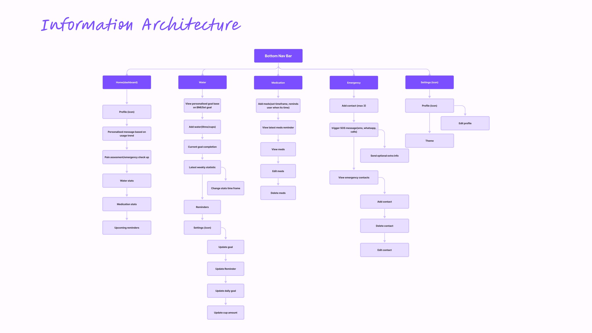
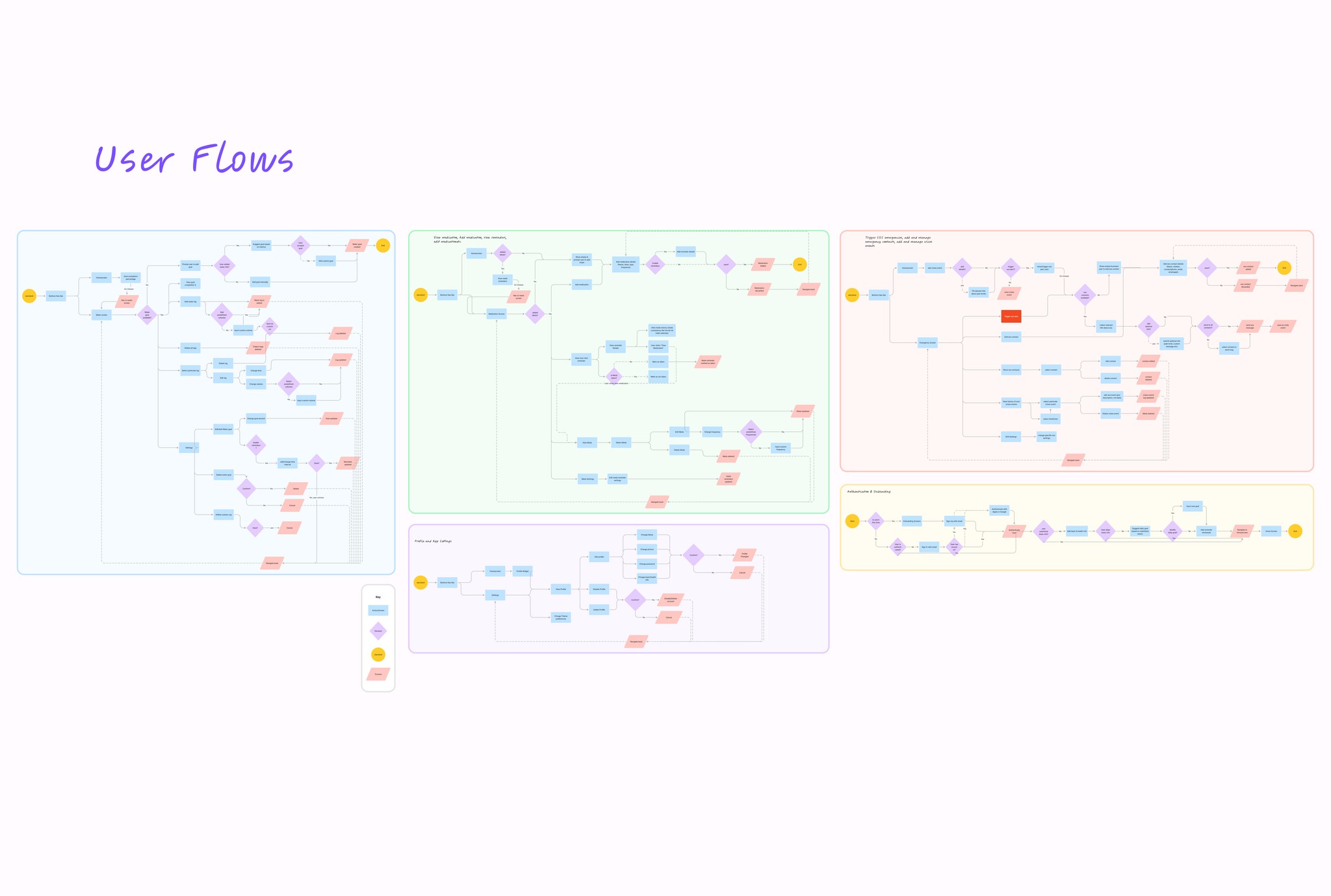
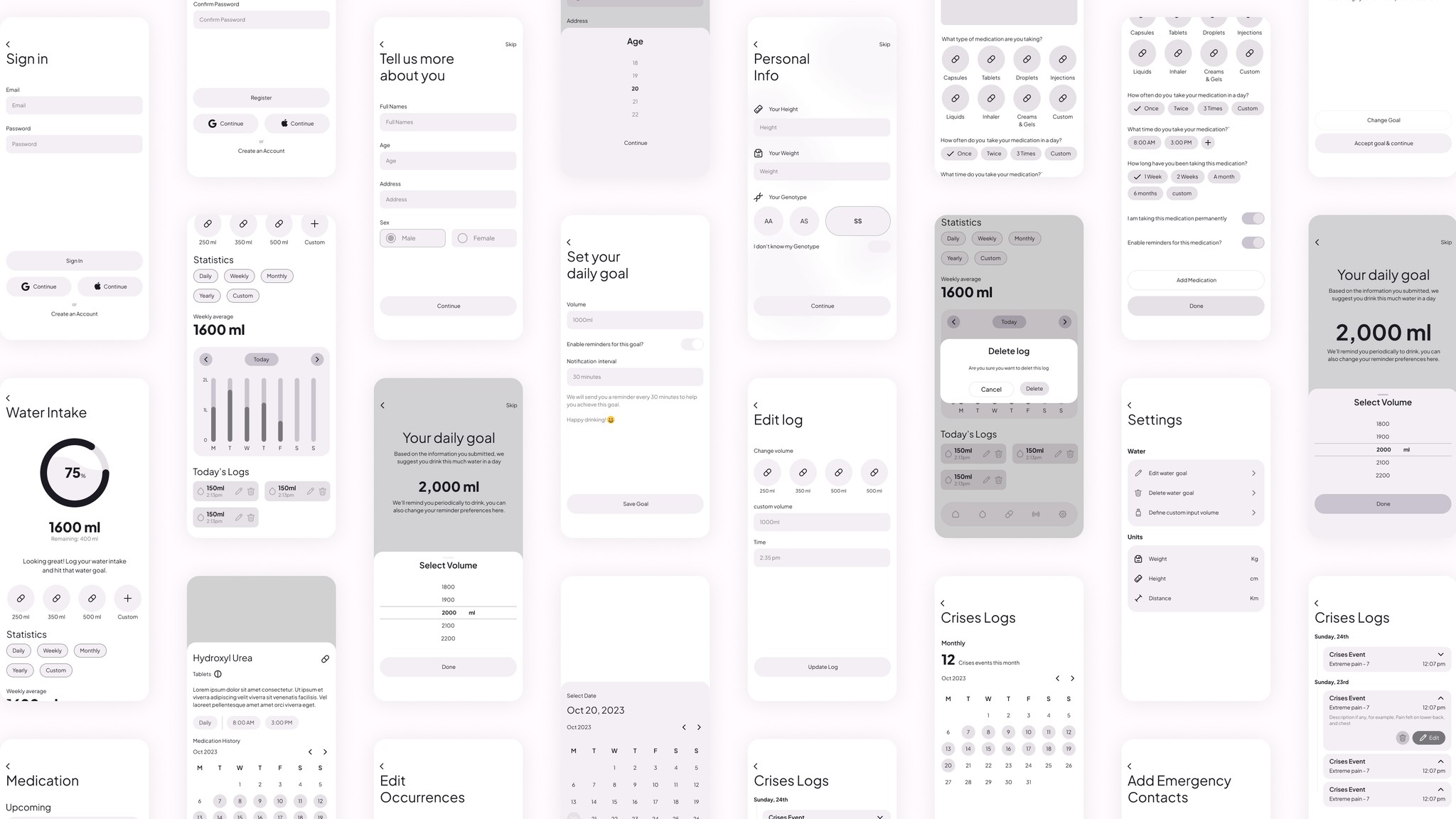
The design process was a journey in itself. We started by mapping out the user's journey through every nook and cranny of the app, from logging in to tracking water intake, medication, emergencies, and more. We wanted to ensure that every step of the way was smooth, intuitive, and tailored to our users' needs
Wireframing
Next, we brought our ideas to life with wireframes and prototypes, keeping John's preferences and mindset at the forefront. We didn't stop there, though. We tested, tweaked, and tested again, incorporating user feedback every step of the way to ensure the app was as user-friendly as possible.
User Interface Design
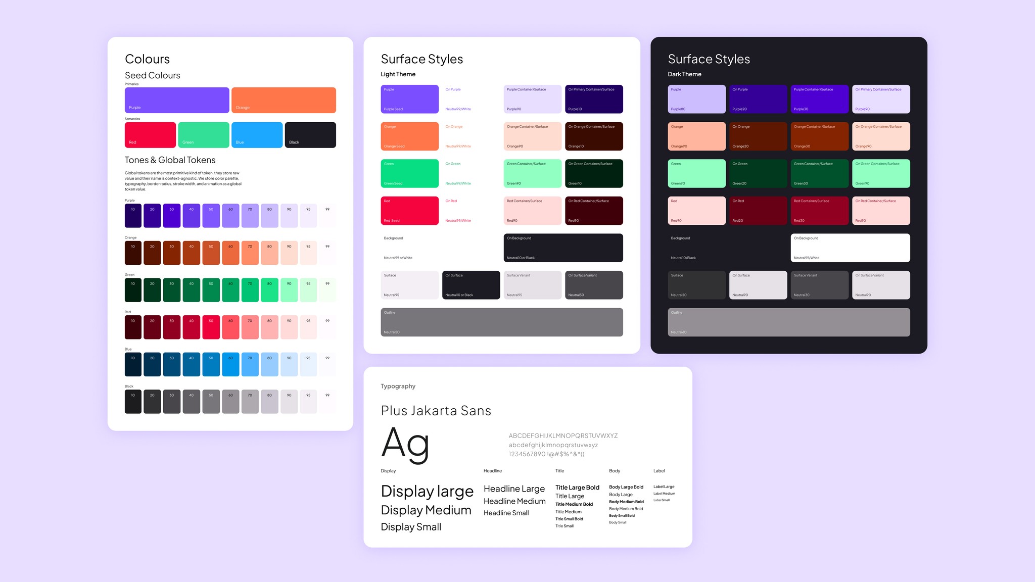
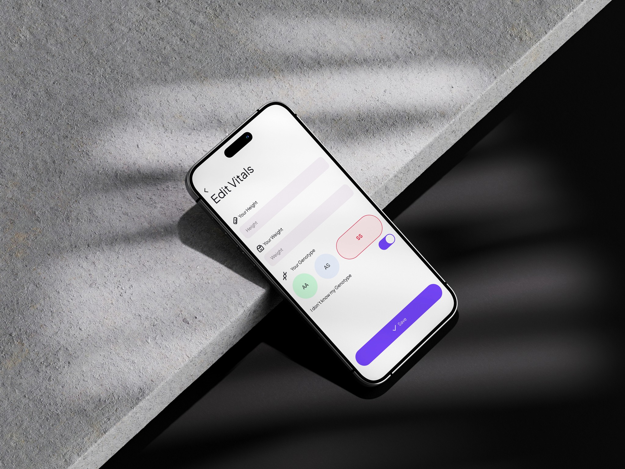
To ensure consistency, efficiency, and ease of development, we created a comprehensive style guide and design system for the Sickle Cell Project Mobile App. This included a set of design tokens, which served as the building blocks for the app's visual language, such as colors, typography, spacing, and component styles. By establishing a standardized design system, we aimed to streamline the design and development process, as well as maintain a coherent visual identity across the app.
The End Result
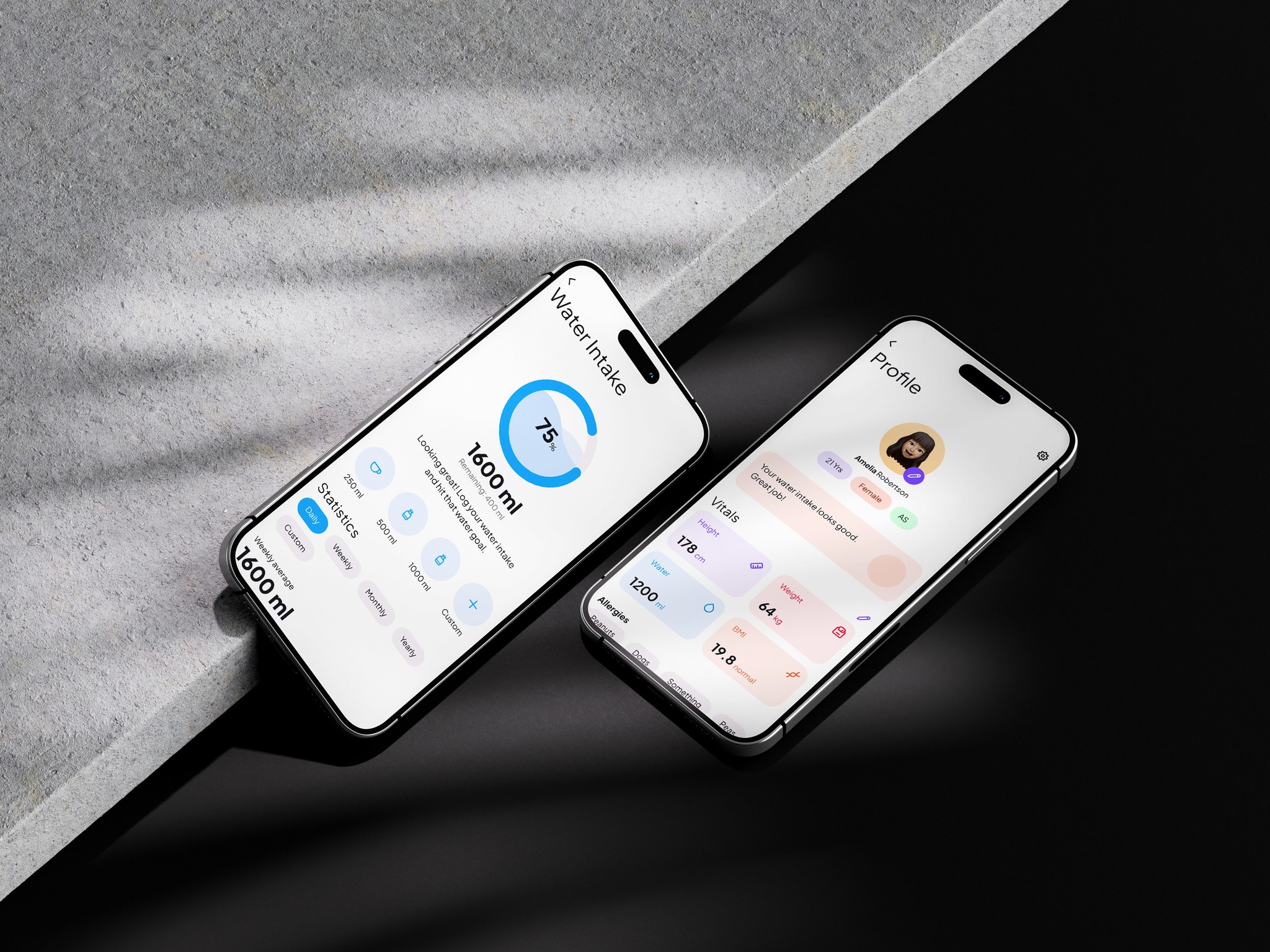
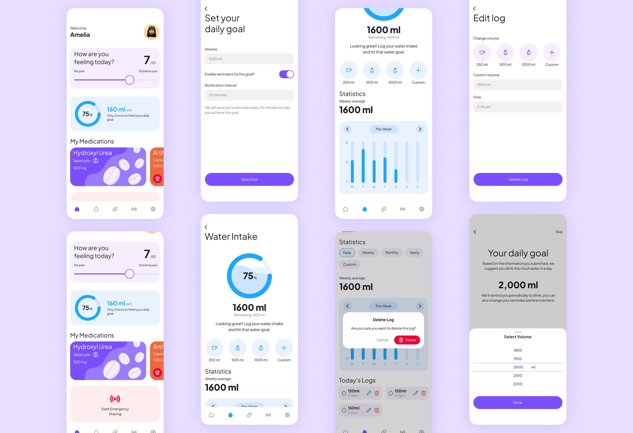
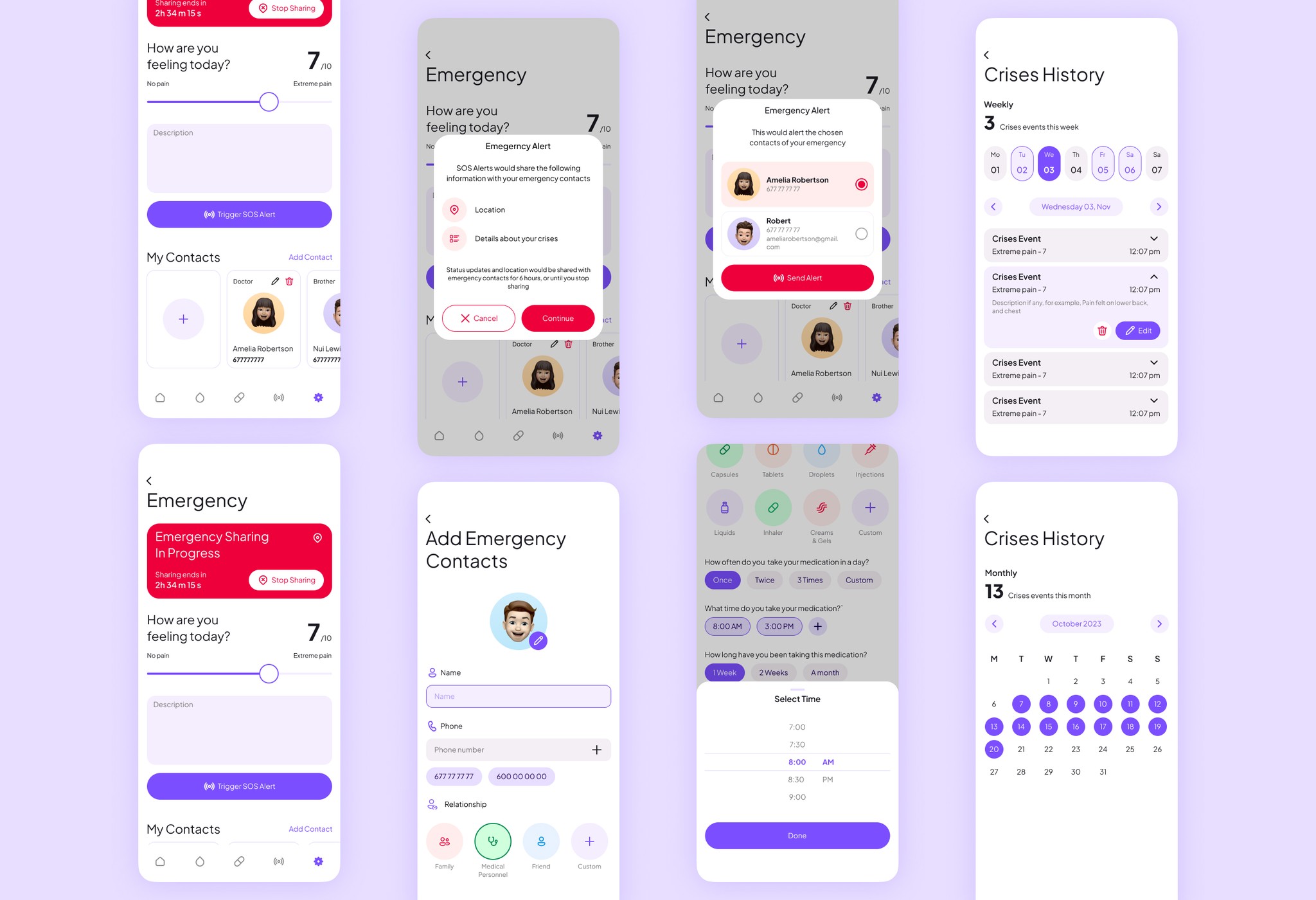
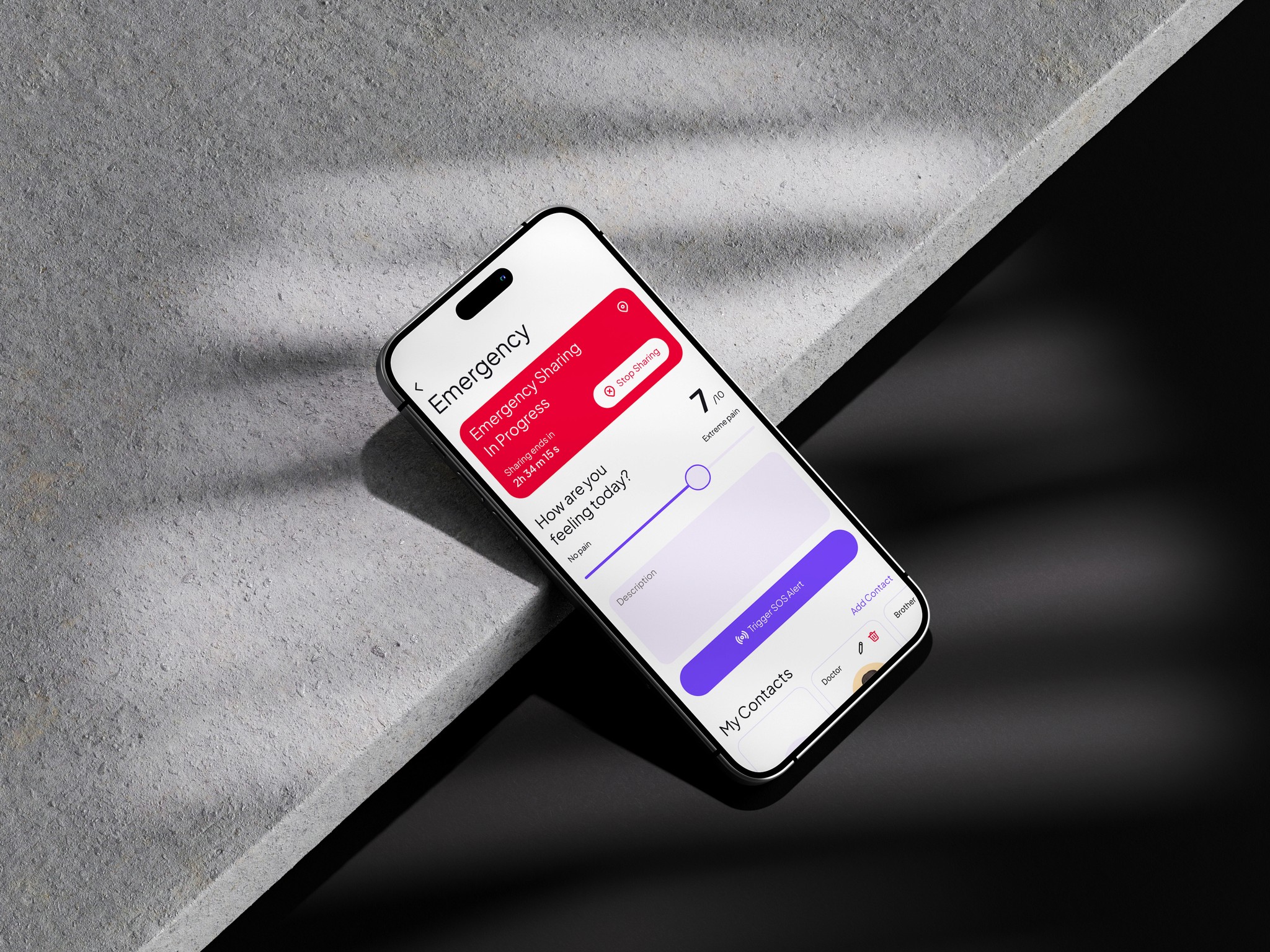
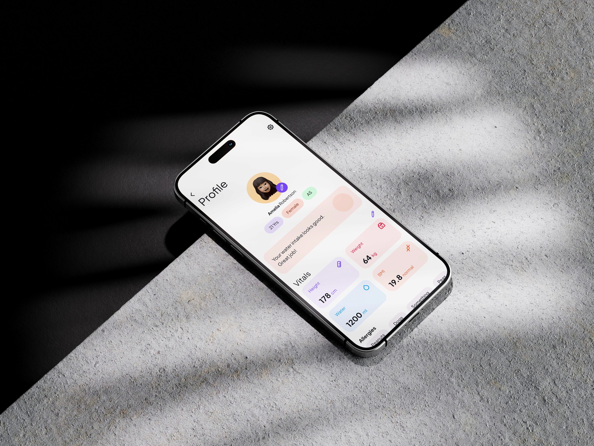
After all that hard work, we ended up with an app that hit the mark. Users could easily track their medication and water intake, access emergency services, and connect with others in the sickle cell community. We were thrilled to hear that users loved the automated data collection and the inclusion of their priority features. The app was more than just functional - it was making a real difference in the lives of those living with sickle cell disease.
The Takeaways
As we wrapped up the project, we took some time to reflect on the lessons learned along the way.
We realised that automated data collection was a game-changer and should be a top priority in future projects.
We also saw the value in gathering user feedback throughout the design process - it was the key to creating an app that truly met the needs of its users.
And finally, we recognised the power of community features in fostering a sense of belonging and support among users.